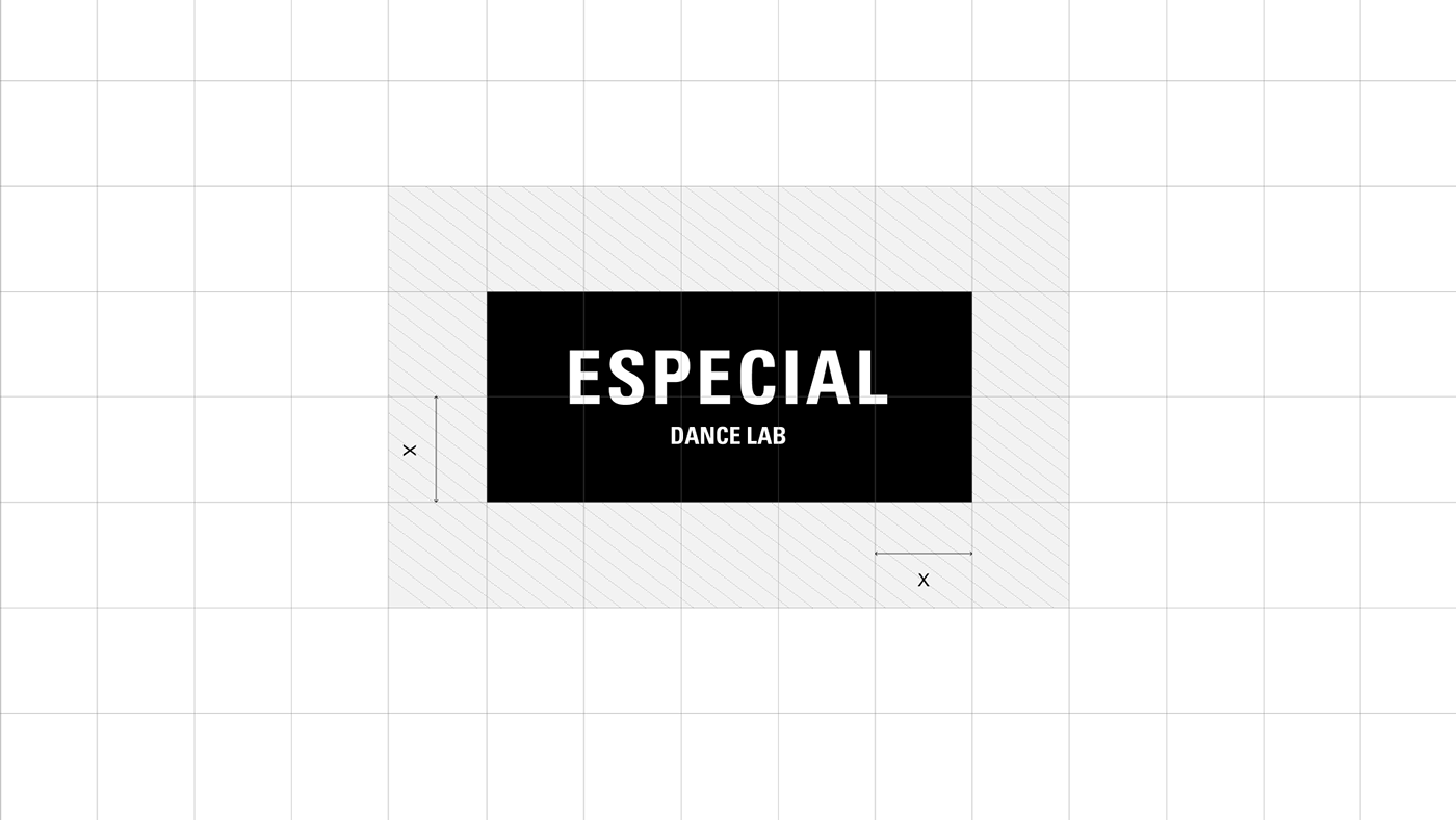
ESPECIAL Dance Lab
Brand Identity
Brand Identity
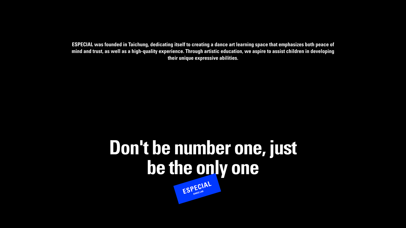
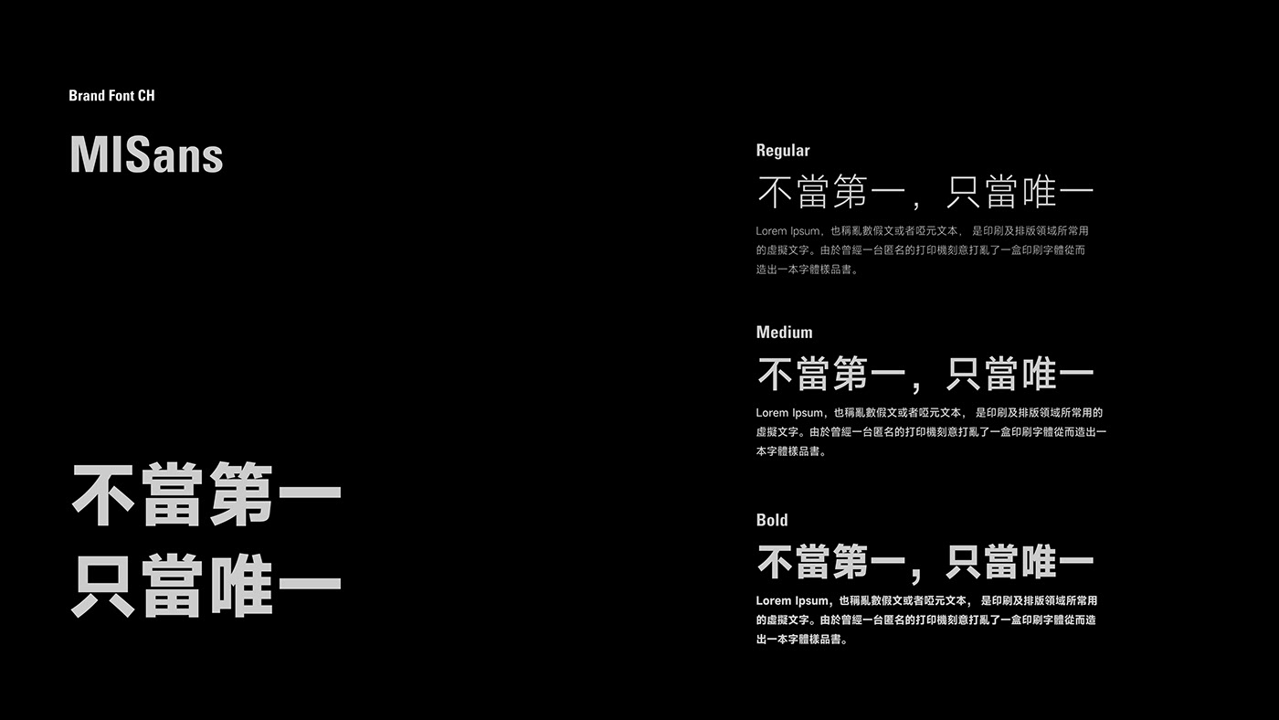
不當第一,只當唯一
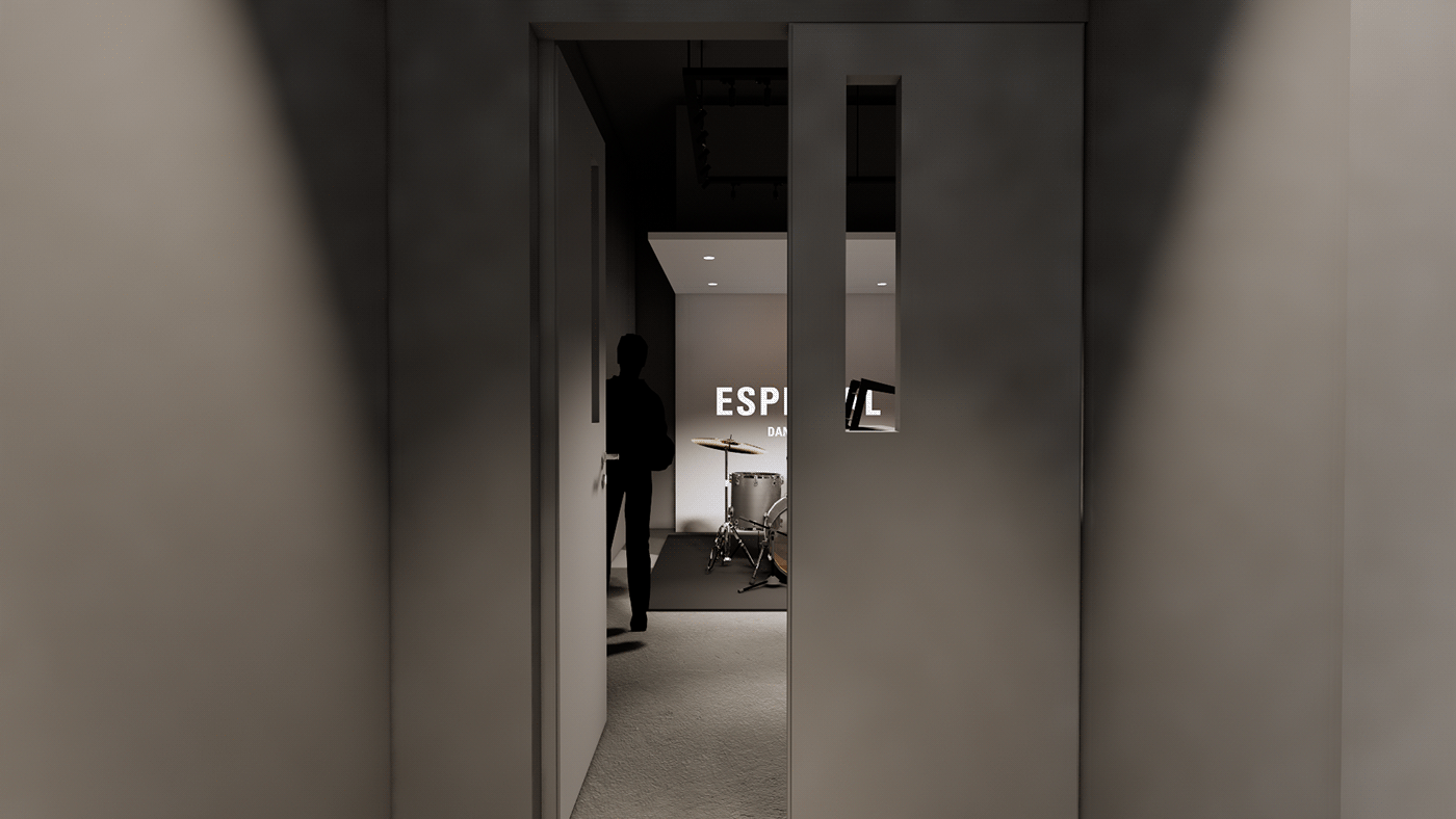
ESPECIAL成立於台中,致力打造安心信任且質感並重的舞蹈藝術學習空間,期望透過藝術教育帶領小朋友們發展出屬於自己的想法個性以及自信大方的表達能力。
設計團隊以「自定義」出發,作為品牌塑造之策略原則,從品牌命名到品牌識別之建構,皆期待傳達出對於教育的開放性與獨特性,貫徹品牌經營理念,傳達顛覆藝術與自我定義的核心思想。
Dare to Be Unique
ESPECIAL was established in Taichung, dedicated to creating a dance art learning space that emphasizes trust, a sense of security, and quality. Through art education, the goal is to guide children in developing their own unique ideas, personality, and confident expression.
The design team starts with "customization" as the strategic principle for brand shaping. From brand naming to brand identity construction, the aim is to convey openness and uniqueness in education, embodying the brand management philosophy and conveying the core idea of subverting art and self-definition.
The design team starts with "customization" as the strategic principle for brand shaping. From brand naming to brand identity construction, the aim is to convey openness and uniqueness in education, embodying the brand management philosophy and conveying the core idea of subverting art and self-definition.
設計策略
定義自我、顛覆想像
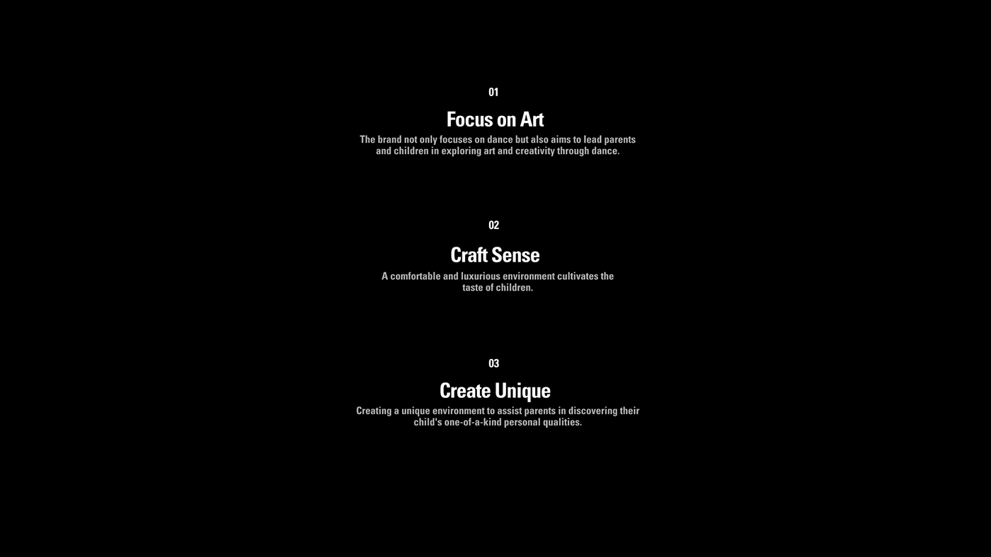
在ESPECIAL Dance Lab的概念中,期待學童來到這個場域不僅僅是學習,更希望透過開放的思維引導學生自我表達、突破過往框架的限制,在藝術中定義自我並打破過往傳懂的想像。
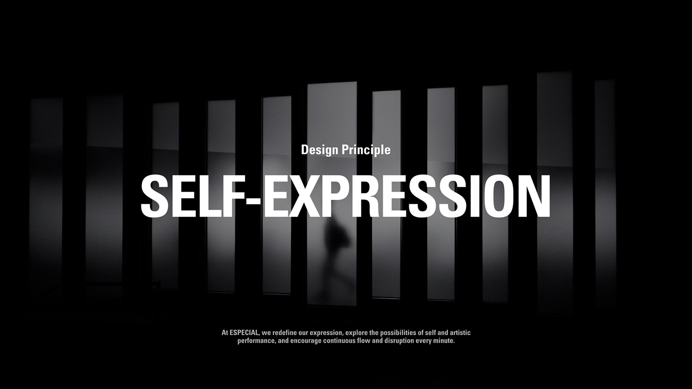
設計團隊希望透過「自定義」將品牌定調於簡約當代風格,透過最基本的造型將表現空間留給品牌:在ESPECIAL我們自定義我們的表達、探索自我與藝術表現的可能性,鼓勵在每分每秒持續流動與顛覆。
在ESPECIAL Dance Lab的概念中,期待學童來到這個場域不僅僅是學習,更希望透過開放的思維引導學生自我表達、突破過往框架的限制,在藝術中定義自我並打破過往傳懂的想像。
設計團隊希望透過「自定義」將品牌定調於簡約當代風格,透過最基本的造型將表現空間留給品牌:在ESPECIAL我們自定義我們的表達、探索自我與藝術表現的可能性,鼓勵在每分每秒持續流動與顛覆。
Design Strategy
Defining the self, challenging imagination
In the concept of ESPECIAL Dance Lab, children are expected to come to this space not only to learn but also to guide students in self-expression, break through past constraints, define themselves in art, and shatter traditional imaginations. The design team aims to define the brand in a simple contemporary style through "customization," leaving space for the brand with the most basic shapes: at ESPECIAL, we define our expression, explore the possibilities of self and artistic expression, encouraging continuous flow and subversion every minute and every second.
In the concept of ESPECIAL Dance Lab, children are expected to come to this space not only to learn but also to guide students in self-expression, break through past constraints, define themselves in art, and shatter traditional imaginations. The design team aims to define the brand in a simple contemporary style through "customization," leaving space for the brand with the most basic shapes: at ESPECIAL, we define our expression, explore the possibilities of self and artistic expression, encouraging continuous flow and subversion every minute and every second.
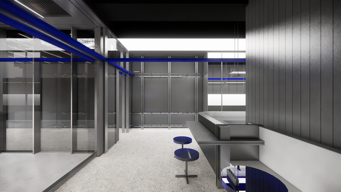
品牌識別
以簡練大器收納可能性
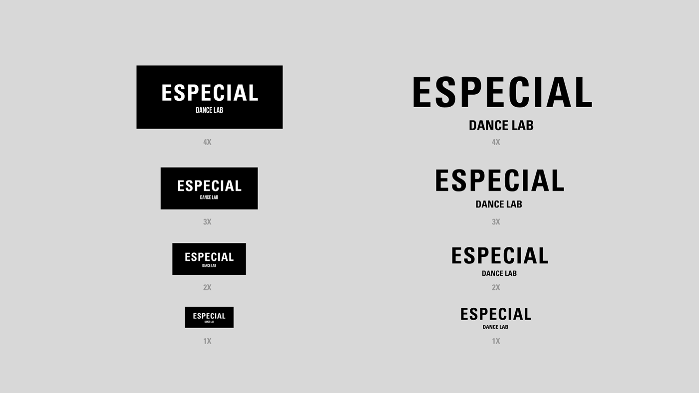
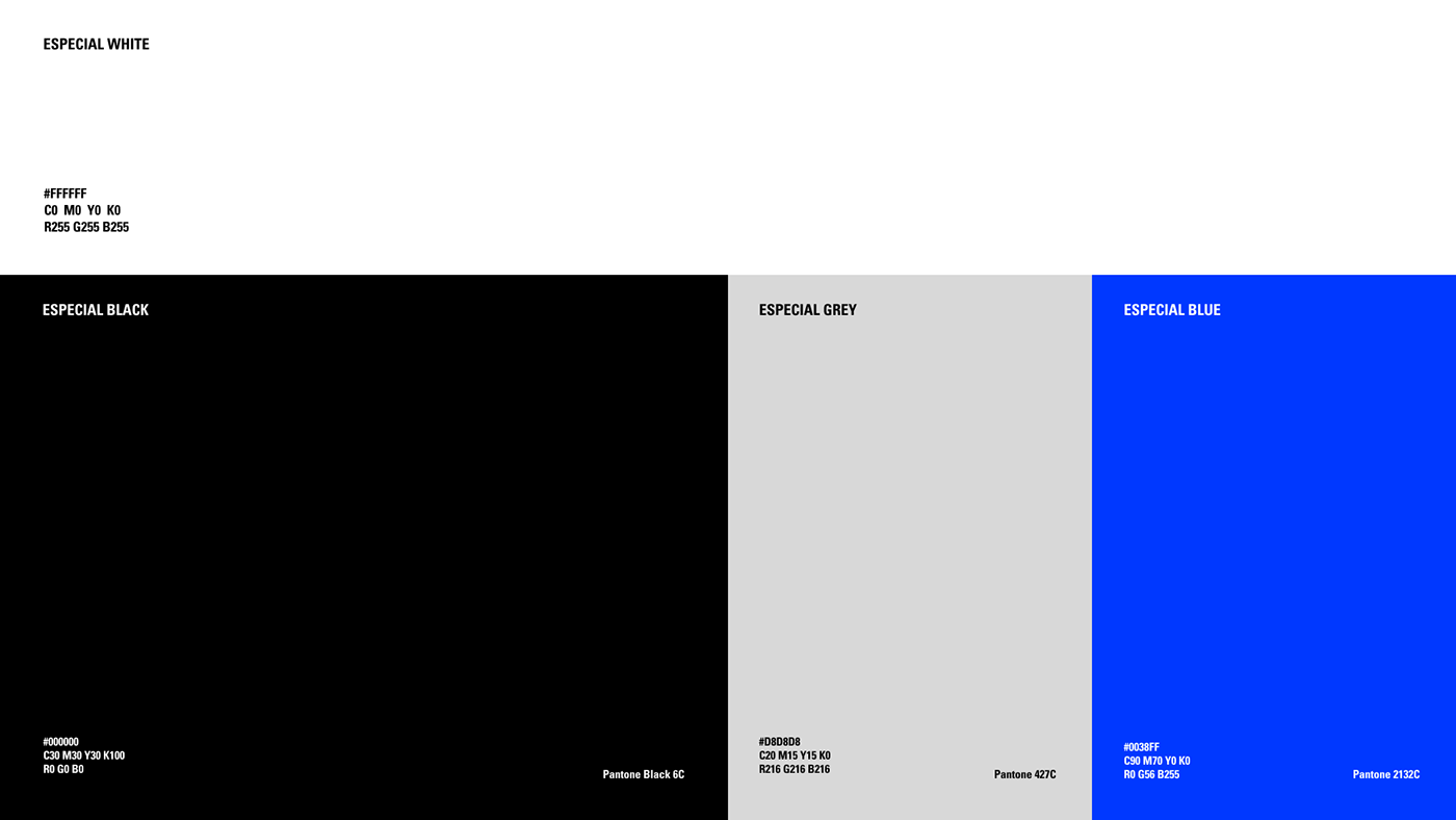
標誌Logo上以簡練大器的文字形象表現穩定與統一性,沒有過多的圖像與裝飾只留下精煉後之基本造型,以打造與未來藝術空間的各種創意有更佳的相容性,色彩同樣以少量的無彩色系統搭配標誌性的藍色,展現出更多穩定與聚焦之空間感受。
標誌Logo上以簡練大器的文字形象表現穩定與統一性,沒有過多的圖像與裝飾只留下精煉後之基本造型,以打造與未來藝術空間的各種創意有更佳的相容性,色彩同樣以少量的無彩色系統搭配標誌性的藍色,展現出更多穩定與聚焦之空間感受。
Brand Identity
Encapsulating Possibilities with Simplicity and Grandeur
The logo embodies stability and unity through a simple and grandeur text image, devoid of excessive graphics and decorations, focusing solely on refined basic shapes. This approach aims to enhance compatibility with various creative elements in future art spaces. The color scheme features a minimalistic non-color system paired with a distinctive blue, creating a sense of stability and focus in the space.
The logo embodies stability and unity through a simple and grandeur text image, devoid of excessive graphics and decorations, focusing solely on refined basic shapes. This approach aims to enhance compatibility with various creative elements in future art spaces. The color scheme features a minimalistic non-color system paired with a distinctive blue, creating a sense of stability and focus in the space.

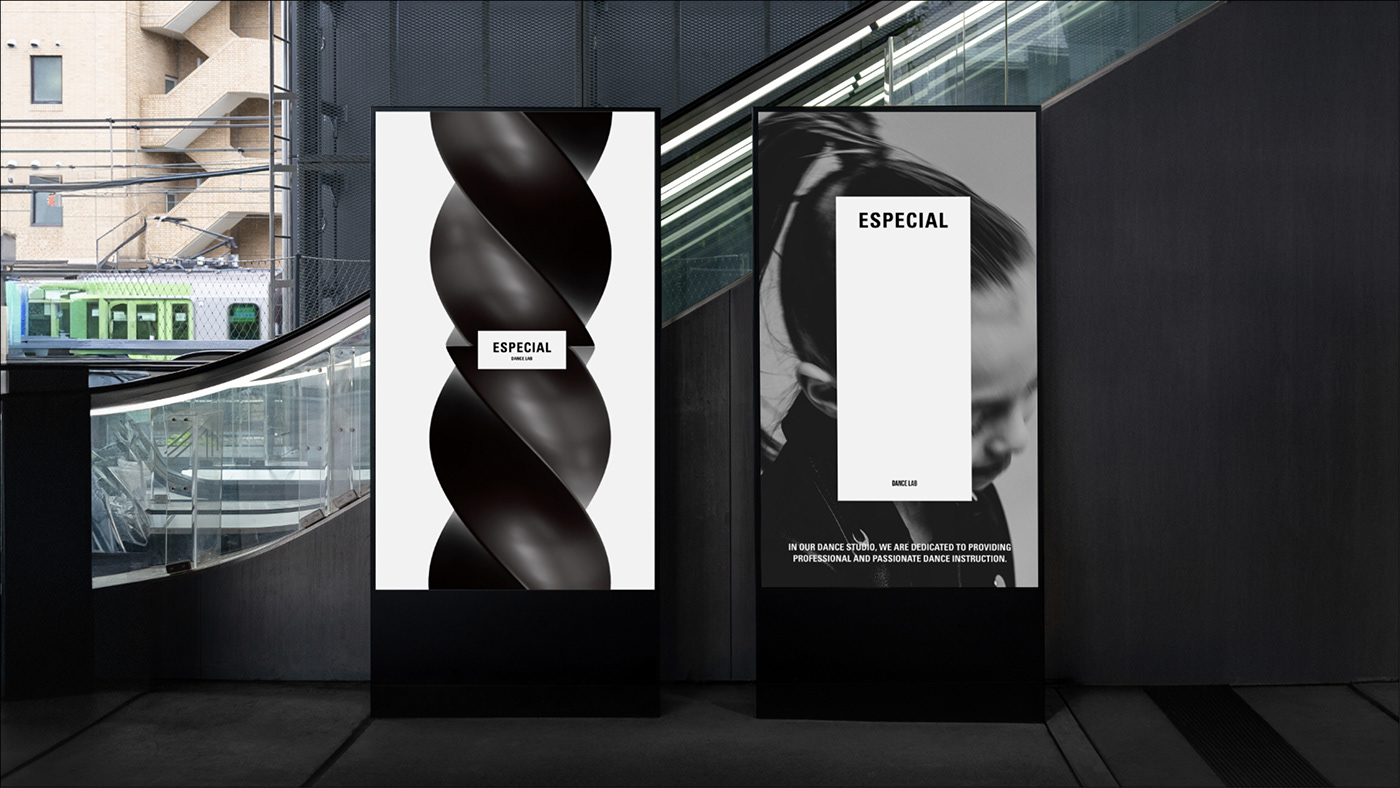
品牌視覺語彙
創造律動、詮釋舞蹈姿態
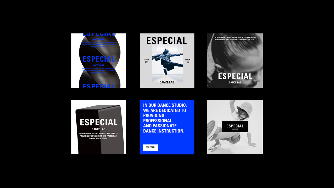
在識別整體上聚焦在動態應用上帶來的品牌變化性,以動態表現為呼應舞蹈教學與藝術的變動性,在標誌上則以簡練大器表現穩定與統一性。透過動態的品牌圖騰,將舞蹈與藝術中的各種姿態、表現、想像持續流動與擺動,表現品牌之多元樣貌。
在識別整體上聚焦在動態應用上帶來的品牌變化性,以動態表現為呼應舞蹈教學與藝術的變動性,在標誌上則以簡練大器表現穩定與統一性。透過動態的品牌圖騰,將舞蹈與藝術中的各種姿態、表現、想像持續流動與擺動,表現品牌之多元樣貌。
Visual Materials
Create rhythm, interpret dance postures
Focusing on the dynamic application's impact on brand variability in overall identification, the emphasis is on dynamic representation to echo the variability of dance teaching and art. In the logo, simplicity and sophistication are used to convey stability and uniformity. Through dynamic brand symbols, various postures, expressions, and imaginations in dance and art continue to flow and sway, showcasing the diverse facets of the brand.
Focusing on the dynamic application's impact on brand variability in overall identification, the emphasis is on dynamic representation to echo the variability of dance teaching and art. In the logo, simplicity and sophistication are used to convey stability and uniformity. Through dynamic brand symbols, various postures, expressions, and imaginations in dance and art continue to flow and sway, showcasing the diverse facets of the brand.


ESPECIAL Dance Lab Brand Identity
Interior Design Agency | 目向制作muuk
Brand Design Agency | StudioPros Design
Art Director | 李宜軒 Yi-Hsuan Li
Brand Experience Director | 張文馨 Moon Chang
Brand Naming | 張文馨 Moon Chan
Visual Design | 李宜軒 Yi-Hsuan Li / 張宇宏 Tako Chang
Logo Design Animation | 張宇宏 Tako Chang
3D Modeling | 羅易崧 Studioxiaosung
Client | Especial Design Lab
Year | 2024


